Today we'll be creating a clone of the iOS 13 control center layout using CSS grid. This type of layout is a great candidate for using CSS grid because of the controls that span multiple columns and rows. We'll only be focusing on the layout and not any actual interactivity because the intention is to use CSS grid (and nested grids) in an interesting, semi real-world use case. Let's get started!
This post assumes you already have some knowledge of CSS grid. If you don't, there are a lot of good resources, like cssgrid.io.
Markup#
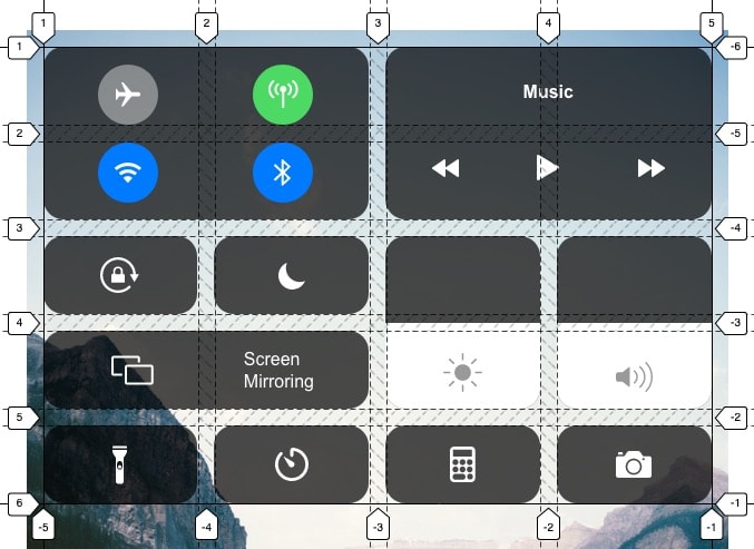
For a better idea of what our underlying grid should look like, please refer to this screenshot.
To begin, let's create our base grid container. For demonstration purposes, most of the markup in this post will be divs. In a more functional example, you would likely want to use more structural HTML, like section, button, etc.
<div class="control-center-grid"></div>
Our base container will have a background image and some height and width sizing constraints. It will have grid properties too, but we'll specifically focus on those later.
.control-center-grid {background: url('./assets/image/background.png') no-repeat center;background-size: cover;max-width: 600px;min-height: 800px;margin: 0 auto;padding: 15px;position: relative;}
Once we have our base, we need to consider all of the different controls that the iOS control center includes. There are 11 different groups of controls: connections (Wifi, bluetooth, etc.), music (play, etc.), screen orientation, night mode, brightness, volume, screen mirroring, flashlight, timer, calculator and camera. These controls will make up all of our outer grid items.
Next, we'll want to create the markup for these controls. The icons I've used are SVGs taken from the iOS 13 design kit.
A note about icons. Depending on your development environment (React via create-react-app in my case), the way you add and use icons will differ. My example assumes importing the SVG file and using it like a React component, using this syntax:
import { ReactComponent as Airplane } from './assets/svg/airplane.svg';
Additionally, most of the icons have fill color properties (white) on them by default, but could just as easily be set with CSS. The brightness and volume icons are gray so that they stand out on a white background.
If you don't want to deal with any icons right now, just add in a text variation of what the icon would represent.
<div class="control-center-grid"><div class="connections grid-item"><div class="airplane-mode"><Airplane /></div><div class="cellular"><Cellular /></div><div class="wifi"><Wifi /></div><div class="bluetooth"><Bluetooth /></div></div><div class="music grid-item"><span>Music</span><div><Rewind /></div><div><Play /></div><div><FastForward /></div></div><div class="orientation grid-item"><Orientation /></div><div class="nightmode grid-item"><NightMode /></div><div class="brightness grid-item"><Brightness /></div><div class="volume grid-item"><Volume /></div><div class="screen grid-item"><Screen /><span>Screen <br />Mirroring</span></div><div class="flashlight grid-item"><Flashlight /></div><div class="timer grid-item"><Timer /></div><div class="calculator grid-item"><Calculator /></div><div class="camera grid-item"><Camera /></div></div>
This should account for all the groups of controls. Note that each group has a class that lets us target it specifically in CSS, as well as a grid-item class for shared styling across all groups.
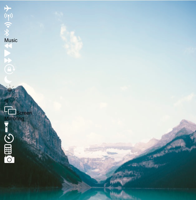
So far your output should look like this. Nothing pretty yet! Next we'll add some styles to improve this.
The Grid Layout and Styles#
Going back to our control-center-grid element, let's add some CSS grid properties.
.control-center-grid {...display: grid;grid-template-columns: repeat(4, 1fr);grid-template-rows: repeat(5, 70px);grid-gap: 15px;}
First we want to set display: grid to set up our outer grid. We want four equal width columns and five rows that are 70px tall. The gap between them should be 15px.
Now for some shared styling. We want each "group" of controls to have a semi transparent background, rounded corners, consistent padding and some flexbox properties to help center the icons. The z-index here is important, as we'll find out later.
.grid-item {background: rgba(0, 0, 0, 0.7);border-radius: 18px;padding: 15px;display: flex;justify-content: center;align-items: center;z-index: 1;}
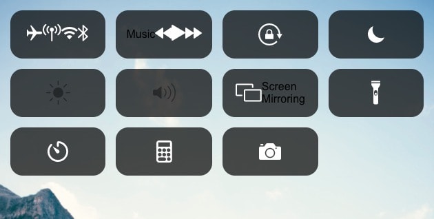
Now we have what looks like a grid!
Next let's focus on the first group of "connection" controls (Wifi, bluetooth, etc). This is where we add our first nested grid. Since we want our nested grid to be two columns, we add grid-template-columns: repeat(2, 1fr).
We want our nested grid to span two columns and two rows as well within our outer grid. To do this we add grid-column: span 2 and grid-row: span 2. Lastly, we want to add justify-items: center to center the inner divs that contain the icons.
.connections {display: grid;grid-template-columns: repeat(2, 1fr); /* OR 1fr 1fr */grid-gap: 15px;grid-row: span 2;grid-column: span 2;justify-items: center;}
Now let's style the inner controls in this grid. The styles here are a bit more straightforward. We want each inner div to have some flexbox properties in order to center the icon.
For a bit of effect, we'll add some background colors to the cellular, Wifi and bluetooth elements.
.connections div {display: flex;justify-content: center;align-items: center;border-radius: 50%;background: rgba(255, 255, 255, 0.4);height: 54px;width: 54px;}.connections .cellular {background: #4CD964;}.connections .wifi,.connections .bluetooth {background: #007AFF;}
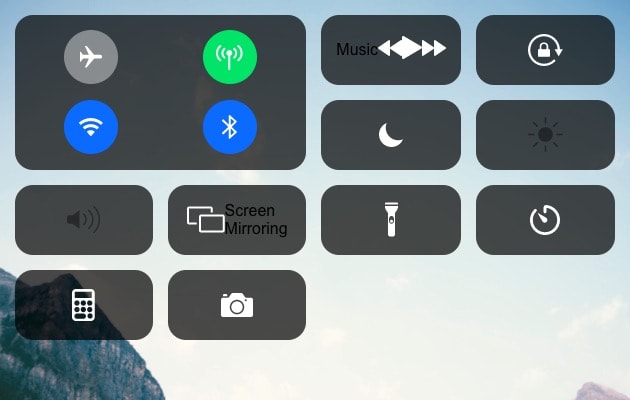
That completes the connections grid! Next let's move on to the music controls grid.
.music {display: grid;grid-column: span 2;grid-row: span 2;grid-template-columns: repeat(3, 1fr);grid-gap: 15px;justify-items: center;}.music span {color: #ffffff;font-weight: 700;grid-column: 1 / -1;}
This grid should be very similar to the previous one. We want it to also take up two columns and two rows within the outer grid. For the rewind, play and fast forward control placement, we want to add grid-template-columns: repeat(3, 1fr) to create a three column grid, with the same grid-gap of 15px to be consistent.
For the "music" text, we add some color and font weight styles, as well as grid-column: 1 / -1, which allows the span to take up all three columns.
That's it for the music grid.
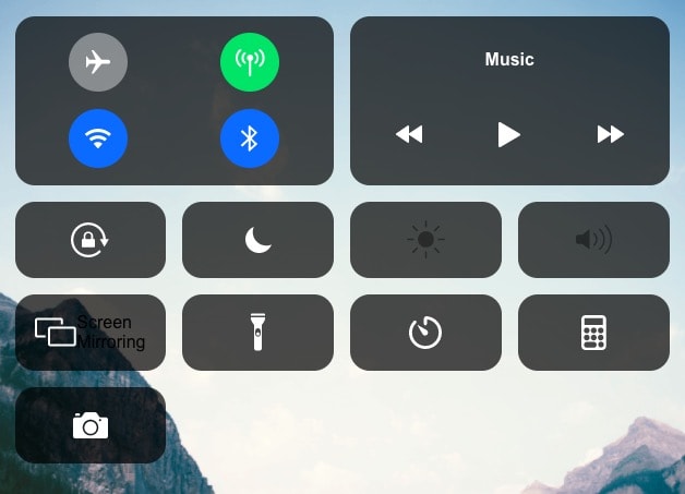
Now for the brightness and volume controls.
.brightness,.volume {grid-row: span 2;justify-content: center;align-items: flex-end;position: relative;}
We want both of these to span two grid rows, so we add grid-row: span 2 and we also want to align the icon at the bottom, so we want the align-items property set to flex-end.
Next we add a white background to these specific controls to demonstrate a brightness/volume level value. We can easily do this by adding a ::before pseudo element to these divs, with a white background. The z-index is important here as well, otherwise the icons will be underneath the pseudo element and not visible.
.brightness::before,.volume::before {bottom: 0;content: '';position: absolute;background: #ffffff;width: 100%;height: 50%;border-radius: 0 0 18px 18px;}.brightness svg,.volume svg {z-index: 1;}
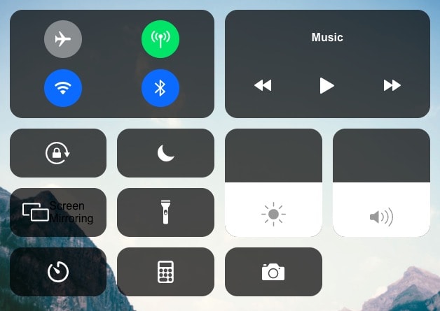
Our last layout piece is around the "screen mirroring" control.
.screen {display: grid;grid-template-columns: repeat(2, 1fr);grid-column: span 2;align-items: center;justify-items: center;}.screen span {text-align: left;color: #ffffff;}
We want this control to have a display of grid because we have the icon on the left and the text on the right. For that, we can add grid-template-columns: repeat(2, 1fr). Note that this could also be done using flexbox and justify-content: space-evenly.
Additionally, this element should span two grid columns within the outer grid. Like the other items we've added so far, we want to add grid-column: span 2 to accomplish this.
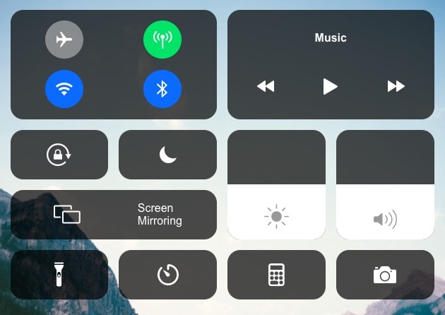
This completes our grid layout!
Blur Effect#
As one final addition, let's add a nice blur effect to our background. This mimics iOS when the notification center is open.
.control-center-grid::after {content: '';position: absolute;width: 100%;height: 100%;backdrop-filter: blur(10px); /* Firefox does not support this property: https://caniuse.com/#search=backdrop-filter */-webkit-backdrop-filter: blur(10px);}
The magic here is the backdrop-filter property. Please note that this property is not yet supported in Firefox, and to support Safari, you will need the -webkit prefix.
This particular pseudo element is the reason we added a z-index to the .grid-item class earlier. This ensures that our grid-items display above this pseudo element.
Summary#
And there you have it! We can accomplish this type of grid layout in CSS relatively easily because of how powerful CSS grid is. We're also able to do so with much less code than we could before.
