
In this tutorial we will create a card carousel UI like the one seen on Stripe.com. This carousel displays its content as a set of cards that animate off the top of the stack when the next item becomes active. It's a bit different than other carousel treatments, but all we need is some positioning and transition trickery to build this. Let's get started!
Card Carousel Functionality#
Before creating any markup, we should first define how the card carousel will work.
- To begin with, we need a number of cards to display some data. We will add this data right into our component, but in the real world, it would be coming from somewhere else, likely a data prop.
- We know that we want to transition through the carousel cards automatically after an interval of a few seconds.
- We'll need to keep track of a few different pieces of state to know which item is active, which one was previously shown, and which one is up next.
Markup and State#
Starting with the layout, let's first create a new React component named CardCarousel.jsx.
import React, { useEffect, useCallback, useState } from 'react';const CardCarousel = () => {const [indexes, setIndexes] = useState({previousIndex: 0,currentIndex: 0,nextIndex: 1,});return ();}
In this component, the useState hook will keep track of our state. Above we identified that we want to maintain the previous item, current item and the next item. We'll do that by storing the item indexes.
We've also imported useCallback and useEffect, which we'll go over later.
Next let's add in some sample data for the carousel cards.
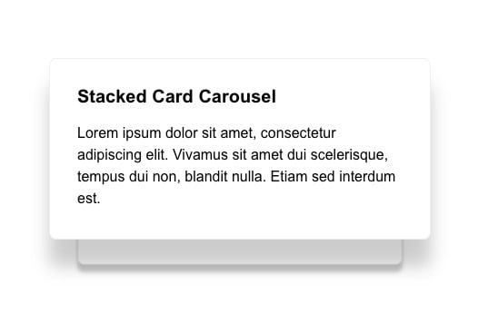
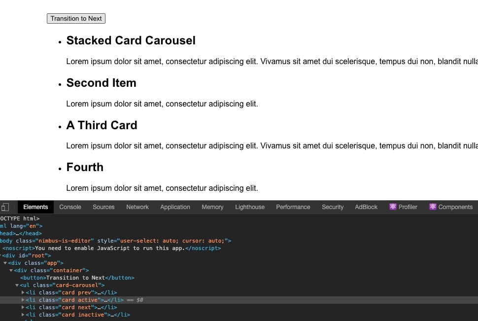
const cardItems = [{id: 1,title: 'Stacked Card Carousel',copy: 'Lorem ipsum dolor sit amet, consectetur adipiscing elit. Vivamus sit amet dui scelerisque, tempus dui non, blandit nulla. Etiam sed interdum est.',},{id: 2,title: 'Second Item',copy: 'Lorem ipsum dolor sit amet, consectetur adipiscing elit.',},{id: 3,title: 'A Third Card',copy: 'Lorem ipsum dolor sit amet, consectetur adipiscing elit. Vivamus sit amet dui scelerisque, tempus dui non, blandit nulla.',},{id: 4,title: 'Fourth',copy: 'Lorem ipsum dolor sit amet, consectetur adipiscing elit.',},];const CardCarousel = () => { ... }
Now for the markup.
When working through this example, we will use a button to manually transition our carousel to the next item. We'll remove this at the end, but I've found that it's helpful for debugging purposes to be able to control the carousel state manually.
return (<div className="container"><button onClick={handleCardTransition}>Transition to Next</button><ul className="card-carousel">{cardItems.map((card, index) => (<likey={card.id}className={`card ${determineClasses(indexes, index)}`}><h2>{card.title}</h2><p>{card.copy}</p></li>))}</ul></div>);
We create our temporary button to move between carousel cards, and an unordered list that contains our card items, making sure each item has a key using the card.id value.
Additionally, we use a function determineClasses that takes our state index data and the current card index to determine which CSS class should be applied to each card at any given time.
function determineClasses(indexes, cardIndex) {if (indexes.currentIndex === cardIndex) {return 'active';} else if (indexes.nextIndex === cardIndex) {return 'next';} else if (indexes.previousIndex === cardIndex) {return 'prev';}return 'inactive';}const CardCarousel = () => { ... }
By using our indexes state data, we can easily determine which card was shown previously, which should be active, and which one is up next just by comparing the corresponding index values against the cards index.
You might be wondering why we need to track the previous and next indexes at all. This is due to the styling treatment. The carousel shows a part of the card that will display next and we need a way to target it. We could possibly accomplish this part with some clever CSS selectors. However, when we get to the end of our carousel cards (index 3 of 3, for example), we want to be able to seamlessly transition back to the first card (index 0), which is now the next card. I could not find a way to do this outside of maintaining a
nextIndexstate and using that to determine what the "next" value should be.The
previousIndexvalue is needed for basically the inverse reason. If we have moved through the cards, and are starting at the first item again (index 0), then the previous value would have been the last item in the carousel.This is a little easier to visualize once the next part is completed, and you can see the classes being added and removed in the DOM.
Finally, we need to add the logic that handles the state updates.
const handleCardTransition = useCallback(() => {// If we've reached the end, start again from the first card,// but carry previous value overif (indexes.currentIndex >= cardItems.length - 1) {setIndexes({previousIndex: cardItems.length - 1,currentIndex: 0,nextIndex: 1,});} else {setIndexes((prevState) => ({previousIndex: prevState.currentIndex,currentIndex: prevState.currentIndex + 1,nextIndex: prevState.currentIndex + 2 === cardItems.length ? 0 : prevState.currentIndex + 2,}));}}, [indexes.currentIndex]);
We are using a useCallback hook here. This means that this function is memoized and won't change unless the indexes.currentIndex value changes. It allows us to use this function without moving it inside of the useEffect hook that we'll add later.
The logic here is split based on if we are at the end of the carousel or not. If we aren't, we set the previousIndex value to our currentIndex value and we increment currentIndex by 1.
Setting the nextIndex is slightly more involved. We can use a ternary operator to check if adding 2 to our currentIndex will put us at the end of the carousel items. If it does, then the next item is actually the first item in our carousel. Otherwise, we add 2.
With all of this out of the way, if you click through the carousel, you should see the correct classes being applied.
The carousel state is now fully functioning, so next we can add our styles.
Styling#
Let's start by adding the card-carousel styles. Most of these these are for alignment purposes to center the cards, as well as to remove any unnecessary bullets and padding.
.card-carousel {list-style: none;padding: 0;display: flex;flex-direction: column;height: 200px;margin: 100px auto;align-items: center;position: relative;}
Next, the styles for the carousel cards.
.card {background: #ffffff;border-radius: 8px;border: 1px solid #eeeeee;padding: 30px;box-shadow: 0 10px 5px rgba(0, 0, 0, 0.1);width: 420px;height: 200px;transition: all 0.75s ease;opacity: 0;position: absolute;transform: scale(0.85) translateY(50px);}.card h2,.card p {line-height: 1.5;margin: 0;}
The styles here are pretty straightforward, but there are a few points to mention.
- The height and width for the cards are specifically defined. The values are arbitrary for this example and could be set to anything, but should probably be set to something.
- We have the opacity for all cards defaulted to 0. Active and next cards are the only ones we want to be visible.
- All cards should be scaled to a slightly smaller value (0.85) and translated downwards 50px by default.
Now let's tackle the active card styling.
.card.active {opacity: 1;transform: scale(1) translateY(0);box-shadow: 0 30px 20px rgba(0, 0, 0, 0.2);z-index: 1;}
Once a card becomes active, it should receive an opacity, scale up to a value of 1, and translate to a value of 0. This will give the card the appearance of shifting from the next position to the active position.
With these styles in place we finally have a card we can see! Clicking the Transition to Next button should also be correctly rotating through the cards.
Let's add the styles for the "next" card.
.card.next {opacity: 1;z-index: 0;}
Fortunately, there is not much to add here. We want the card to be visible, and we want the z-index value to be less than that of the active card.
Finally the styles for our previous card.
.card.prev {transform: scale(1.1) translateY(-50px);z-index: 2;opacity: 0;visibility: hidden;}
When a card moves from active to previous, we want to scale it up slightly, as well as translate it upwards and fade it out via opacity: 0 and visibility: hidden. The important thing to note is that with the help of the prev class, we sort of hold this card in this state until it becomes "inactive" and thus able to achieve this effect.
Running on an Interval#
Now that the carousel is working as we'd expect, let's make an adjustment so the cards rotate on an interval. To do this, we can add a useEffect hook to call our handleCardTransition function every four seconds.
useEffect(() => {const transitionInterval = setInterval(() => {handleCardTransition();}, 4000); // The interval value could also be a prop// Clear the interval when the component unmounts!return () => clearInterval(transitionInterval);}, [handleCardTransition, indexes]);
Recall the useCallback hook we used earlier. That made it possible to call the handleCardTransition function like this from within of the useEffect hook. We could just as easily have moved all of that code into the the setInterval function, but this structure allows for calling handleCardTransition in other scenarios. For example, if we wanted it to run on an interval AND to navigate the carousel cards via a button.
Summary#
In this article, you learned how to build a React card carousel with CSS and React hooks. If you wanted to expand on this component, adding some previous/next controls and a pause button would be great additions!